devtools::install_github("wilkelab/ungeviz")

pacman::p_load(ungeviz, plotly, crosstalk,
               DT, ggdist, ggridges,
colorspace, gganimate, tidyverse)Hands-on Exercise 4 - Visualising Uncertainty
Learning Objectives:
Plot statistics error bars by using ggplot2,
Plot interactive error bars by combining ggplot2, plotly and DT,
Create advanced by using ggdist, and
Create hypothetical outcome plots (HOPs) by using ungeviz package.
Getting Started
Installing and loading the required libraries
The following R packages will be used:
tidyverse, a family of R packages for data science process,
plotly for creating interactive plot,
gganimate for creating animation plot,
DT for displaying interactive html table,
crosstalk for for implementing cross-widget interactions (currently, linked brushing and filtering), and
ggdist for visualising distribution and uncertainty.
Code chunk below will be used to check if these packages have been installed and also will load them into the working R environment.
Importing the Data
The code chunk below imports exam_data.csv into R environment by using read_csv() function of readr package.
readr is a pacakge within tidyverse.
exam <- read_csv("data/Exam_data.csv")exam_data tibble data frame contains:
Year end examination grades of a cohort of primary 3 students from a local school.
There are a total of seven attributes. Four of them are categorical data type and the other three are in continuous data type.
The categorical attributes are: ID, CLASS, GENDER and RACE.
The continuous attributes are: MATHS, ENGLISH and SCIENCE.
Visualizing the uncertainty of point estimates: ggplot2 methods
A point estimate is a single number, e.g., mean. Uncertainty, is expressed as standard error, confidence interval, or credible interval.
The code chunk below will be used to derive the necessary summary statistics.
group_by()of dplyr package is used to group the observation by RACE,summarise()is used to compute the count of observations, mean, standard deviationmutate()is used to derive standard error of Maths by RACE, andthe output is save as a tibble data table called my_sum.
my_sum <- exam %>%
  group_by(RACE) %>%
  summarise(
    n=n(),
    mean=mean(MATHS),
    sd=sd(MATHS)
    ) %>%
  mutate(se=sd/sqrt(n-1))
The code chunk below will be used to display my_sum tibble data frame in an html table format.
| RACE | n | mean | sd | se |
|---|---|---|---|---|
| Chinese | 193 | 76.50777 | 15.69040 | 1.132357 |
| Indian | 12 | 60.66667 | 23.35237 | 7.041005 |
| Malay | 108 | 57.44444 | 21.13478 | 2.043177 |
| Others | 9 | 69.66667 | 10.72381 | 3.791438 |
knitr::kable(head(my_sum), format = 'html')Plotting standard error bars of point estimates
The code chunk belows plots the standard error bars of mean maths score by race.
Note:
The error bars are computed by using the formula mean+/-se.
For
geom_point(), it is important to indicate stat=“identity”.
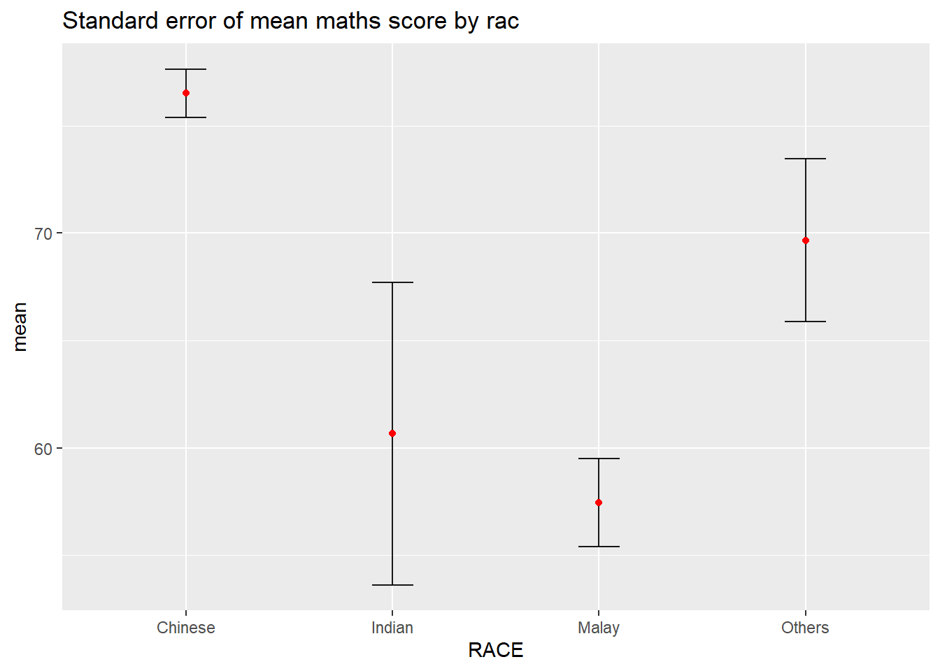
ggplot(my_sum) +
  geom_errorbar(
    aes(x=RACE,
        ymin=mean-se,
        ymax=mean+se),
    width=0.2,
    colour="black",
    alpha=0.9,
    size=0.5) +
  geom_point(aes
           (x=RACE,
            y=mean),
           stat="identity",
           color="red",
           size = 1.5,
           alpha=1) +
  ggtitle("Standard error of mean maths score by rac")
Plotting confidence interval of point estimates
Instead of plotting the standard error bar of point estimates, the confidence intervals of mean maths score by race can also be plotted.
Note:
The confidence intervals are computed by using the formula mean+/-1.96*se.
The error bars is sorted by using the average maths scores.
labs()argument of ggplot2 is used to change the x-axis label.
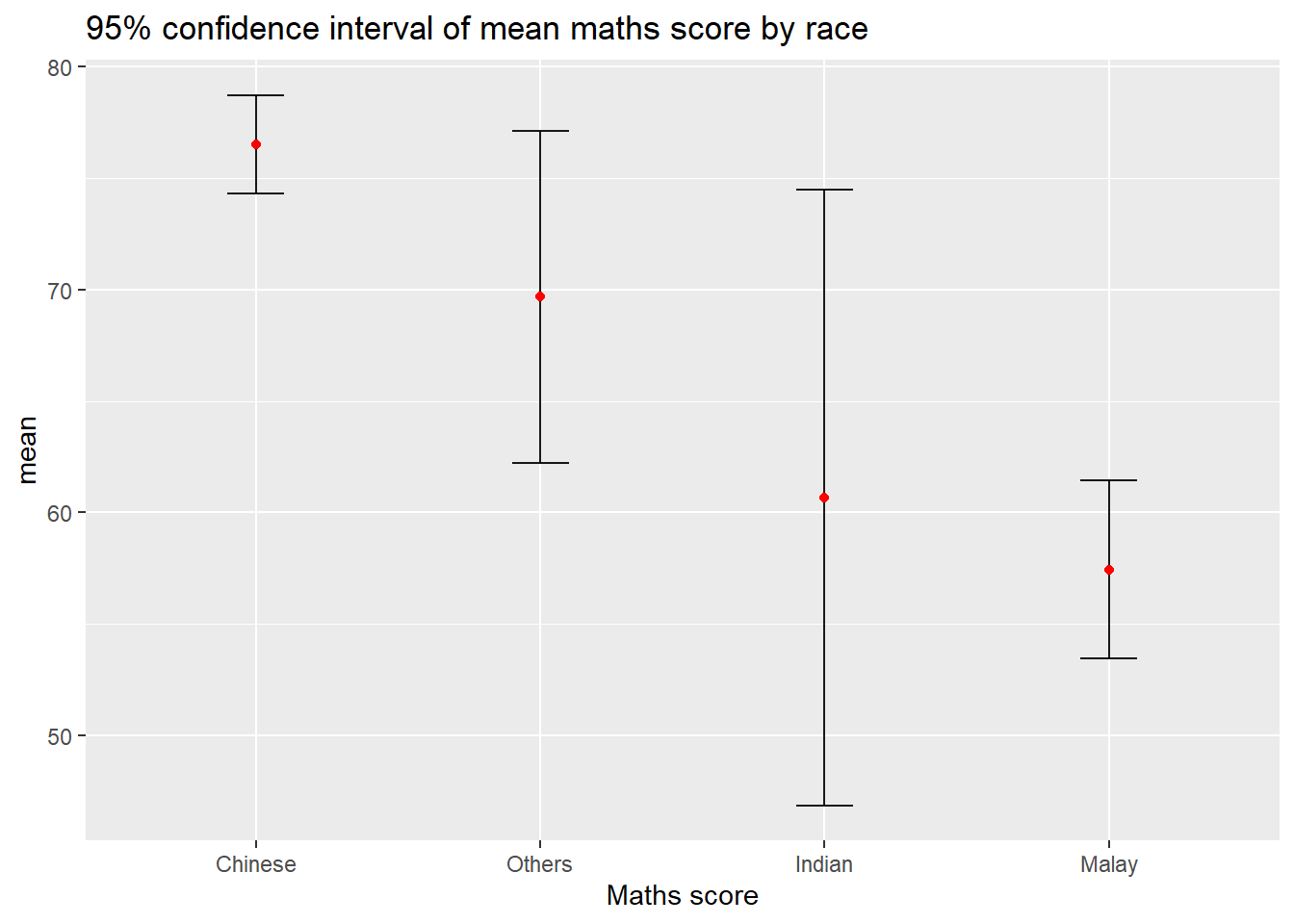
ggplot(my_sum) +
  geom_errorbar(
    aes(x=reorder(RACE, -mean),
        ymin=mean-1.96*se,
        ymax=mean+1.96*se),
    width=0.2,
    colour="black",
    alpha=0.9,
    size=0.5) +
  geom_point(aes
           (x=RACE,
            y=mean),
           stat="identity",
           color="red",
           size = 1.5,
           alpha=1) +
  labs(x = "Maths score",
       title = "95% confidence interval of mean maths score by race")
Visualizing the uncertainty of point estimates with interactive error bars
The code chunk below plots interactive error bars for the 99% confidence interval of mean maths score by race.
shared_df = SharedData$new(my_sum)

bscols(widths = c(4,8),
       ggplotly((ggplot(shared_df) +
                   geom_errorbar(aes(
                     x=reorder(RACE, -mean),
                     ymin=mean-2.58*se,
                     ymax=mean+2.58*se),
                     width=0.2,
                     colour="black",
                     alpha=0.9,
                     size=0.5) +
                   geom_point(aes(
                     x=RACE,
                     y=mean,
                     text = paste("Race:", `RACE`,
                                  "<br>N:", `n`,
                                  "<br>Avg. Scores:", round(mean, digits = 2),
                                  "<br>95% CI:[",
                                  round((mean-2.58*se), digits = 2), ",",
                                  round((mean+2.58*se), digits = 2),"]")),
                     stat="identity",
                     color="red",
                     size = 1.5,
                     alpha=1) +
                   xlab("Race") +
                   ylab("Average Scores") +
                   theme_minimal() +
                   theme(axis.text.x = element_text(
                     angle = 45, vjust = 0.5, hjust=1)) +
                   ggtitle("99% Confidence interval of average /<br>maths scores by race")),
                tooltip = "text"),
       DT::datatable(shared_df,
                     rownames = FALSE,
                     class="compact",
                     width="100%",
                     options = list(pageLength = 10,
                                    scrollX=T),
                     colnames = c("No. of pupils",
                                  "Avg Scores",
                                  "Std Dev",
                                  "Std Error")) %>%
         formatRound(columns=c('mean', 'sd', 'se'),
                     digits=2))
Visualising Uncertainty: ggdist package
ggdist is an R package that provides a flexible set of ggplot2 geoms and stats designed especially for visualising distributions and uncertainty.
It is designed for both frequentist and Bayesian uncertainty visualization, taking the view that uncertainty visualization can be unified through the perspective of distribution visualization:
for frequentist models, one visualises confidence distributions or bootstrap distributions (see vignette(“freq-uncertainty-vis”));
for Bayesian models, one visualises probability distributions (see the tidybayes package, which builds on top of ggdist).
Visualizing the uncertainty of point estimates: ggdist methods
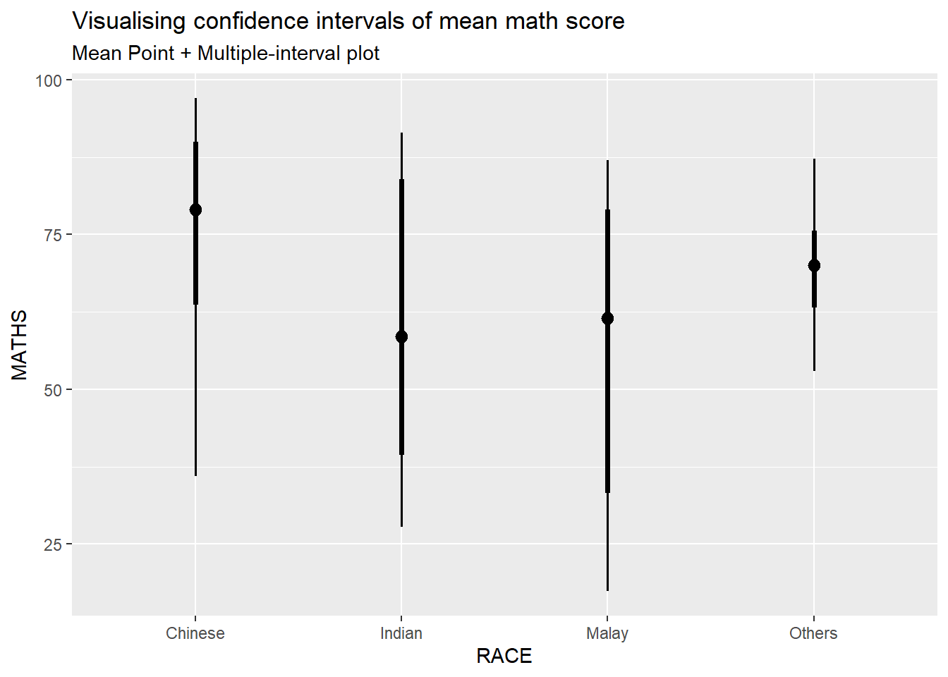
In the code chunk below, stat_pointinterval() of ggdist is used to build a visual for displaying distribution of maths scores by race.

exam %>%
  ggplot(aes(x = RACE,
             y = MATHS)) +
  stat_pointinterval() +
  labs(
    title = "Visualising confidence intervals of mean math score",
    subtitle = "Mean Point + Multiple-interval plot")
In the code chunk below the following arguments are used:
.width = 0.95
.point = median
.interval = qi
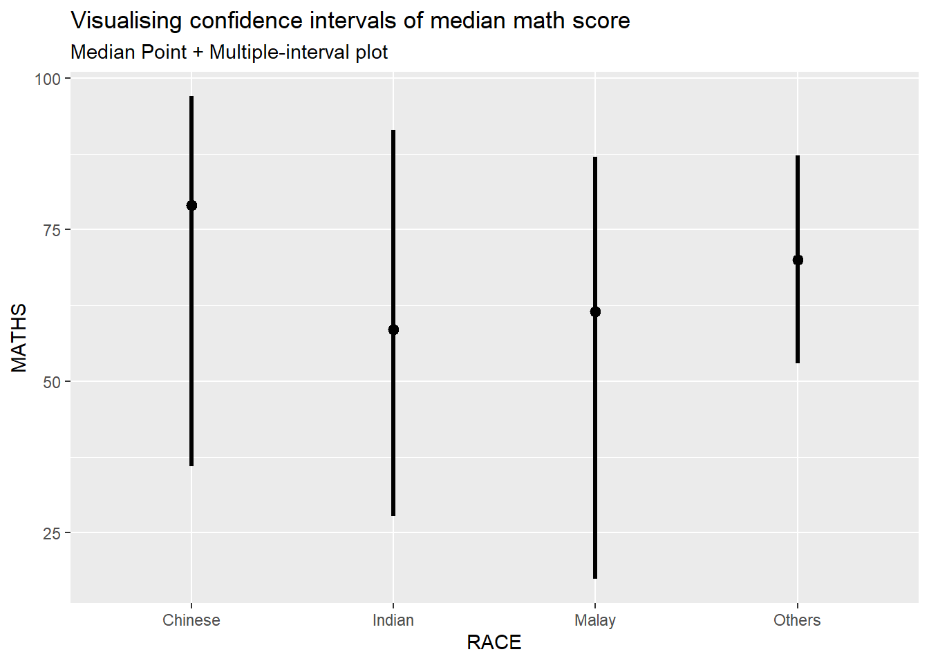
exam %>%
  ggplot(aes(x = RACE, y = MATHS)) +
  stat_pointinterval(.width = 0.95,
  .point = median,
  .interval = qi) +
  labs(
    title = "Visualising confidence intervals of median math score",
    subtitle = "Median Point + Multiple-interval plot")
The plot below shows 95% and 99% confidence intervals
stat_pointintervalis used twice, once for each confidence interval.The
.widthargument specifies the width of the intervals.The
.pointargument specifies that we want to plot the median.The
.intervalargument is set to “quantile” to indicate quantile-based intervals.scale_colour_manualis used to set custom colors for the confidence intervals and provide custom labels.Other aesthetic adjustments are made to improve the appearance of the plot, such as adjusting the size and position of the intervals.
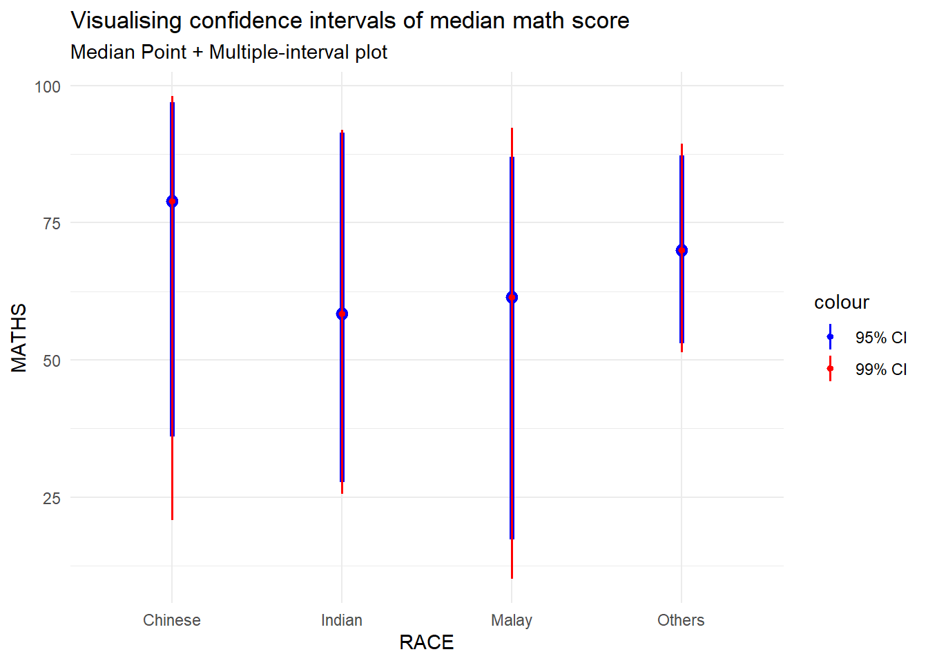
exam %>%
  ggplot(aes(x = RACE, y = MATHS)) +
  stat_pointinterval(
    .width = 0.95,
    .point = "median",
    .interval = "quantile",
    aes(colour = "95% CI")) +
  stat_pointinterval(
    .width = 0.99,
    .point = "median",
    .interval = "quantile",
    aes(colour = "99% CI")) +
  scale_colour_manual(
    values = c("95% CI" = "blue", "99% CI" = "red"),
    labels = c("95% CI", "99% CI")) +
  labs(
    title = "Visualising confidence intervals of median math score",
    subtitle = "Median Point + Multiple-interval plot") +
  theme_minimal()
Visualizing the uncertainty of point estimates: ggdist methods
exam %>%
  ggplot(aes(x = RACE,
             y = MATHS)) +
  stat_pointinterval(
    show.legend = FALSE) +
  labs(
    title = "Visualising confidence intervals of mean math score",
    subtitle = "Mean Point + Multiple-interval plot")
Visualising the uncertainty of point estimates: ggdist methods
In the code chunk below, stat_gradientinterval() of ggdist is used to build a visual for displaying distribution of maths scores by race.
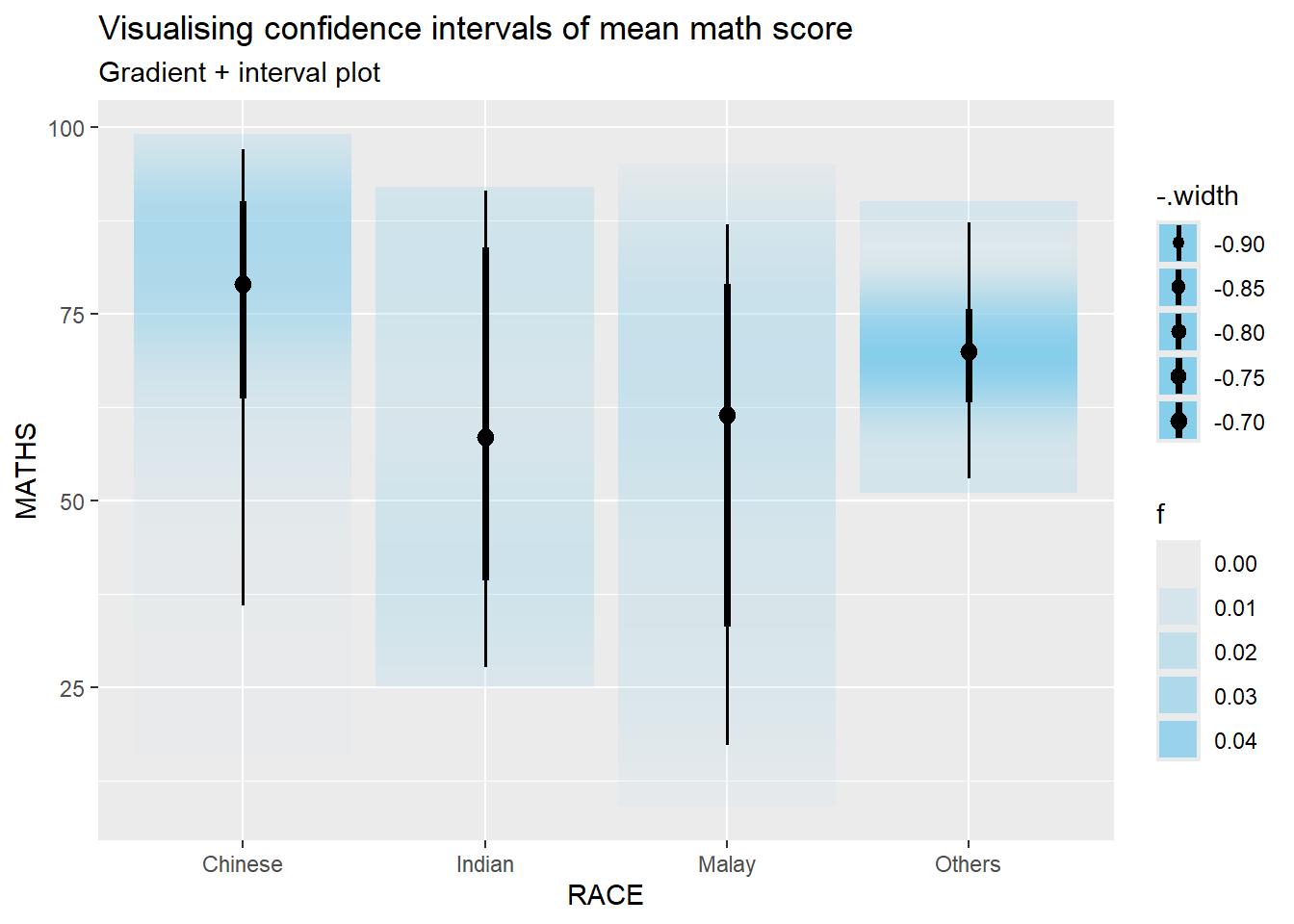
exam %>%
  ggplot(aes(x = RACE,
             y = MATHS)) +
  stat_gradientinterval(
    fill = "skyblue",
    show.legend = TRUE
  ) +
  labs(
    title = "Visualising confidence intervals of mean math score",
    subtitle = "Gradient + interval plot")
Visualising Uncertainty with Hypothetical Outcome Plots (HOPs)
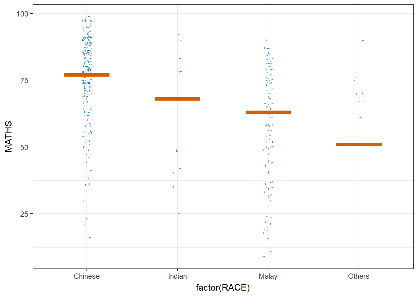
ggplot(data = exam,
       (aes(x = factor(RACE), y = MATHS))) +
  geom_point(position = position_jitter(
    height = 0.3, width = 0.05),
    size = 0.4, color = "#0072B2", alpha = 1/2) +
  geom_hpline(data = sampler(25, group = RACE), height = 0.6, color = "#D55E00") +
  theme_bw() +
  # `.draw` is a generated column indicating the sample draw
  transition_states(.draw, 1, 3)
Visualising Uncertainty with Hypothetical Outcome Plots (HOPs)
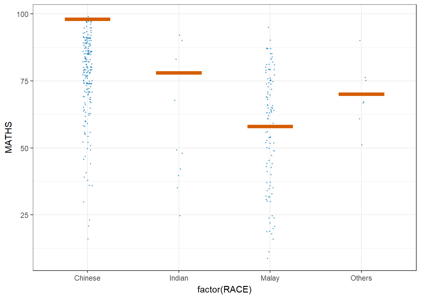
ggplot(data = exam,
       (aes(x = factor(RACE),
            y = MATHS))) +
  geom_point(position = position_jitter(
    height = 0.3,
    width = 0.05),
    size = 0.4,
    color = "#0072B2",
    alpha = 1/2) +
  geom_hpline(data = sampler(25,
                             group = RACE),
              height = 0.6,
              color = "#D55E00") +
  theme_bw() +
  transition_states(.draw, 1, 3)