pacman::p_load(GGally, parallelPlot, tidyverse)Hands-on Exercise 9 Part IV - Visual Multivariate Analysis with Parallel Coordinates Plot
Learning Objectives:
- plotting statistic parallel coordinates plots by using ggparcoord() of GGally package,
- plotting interactive parallel coordinates plots by using parcoords package, and
- plotting interactive parallel coordinates plots by using parallelPlot package.
Getting Started
Parallel coordinates plot is a data visualisation specially designed for visualising and analysing multivariate, numerical data. It is ideal for comparing multiple variables together and seeing the relationships between them.
Parallel coordinates was invented by Alfred Inselberg in the 1970s as a way to visualize high-dimensional data. This data visualisation technique is more often found in academic and scientific communities than in business and consumer data visualisations.
Installing and loading the required libraries
The following R packages will be used:
GGally
parallelPlot
tidyverse
Code chunk below will be used to check if these packages have been installed and also will load them into the working R environment.
Importing Data into R
The Data
The World Happinees 2018 data will be used. The data set is downloaded here. The original data set is in Microsoft Excel format. It has been extracted and saved in csv file called WHData-2018.csv.
Importing Data
In the code chunk below, read_csv() of readr is used to import WHData-2018.csv into R and parsed it into tibble R data frame format.
wh <- read_csv("data/WHData-2018.csv")Plotting Static Parallel Coordinates Plot
Plot static parallel coordinates plot by using ggparcoord() of GGally package.
Plotting a simple parallel coordinates
Code chunk below shows a typical syntax used to plot a basic static parallel coordinates plot by using ggparcoord().
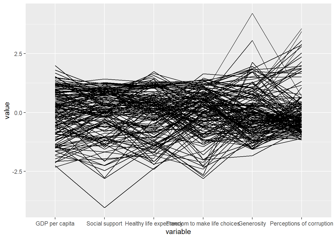
ggparcoord(data = wh,
           columns = c(7:12))
Note
Note that only two argument namely data and columns is used. Data argument is used to map the data object (i.e. wh) and columns is used to select the columns for preparing the parallel coordinates plot.
Plotting a parallel coordinates with boxplot
The basic parallel coordinates failed to reveal any meaning understanding of the World Happiness measures. Makeover the plot by using a collection of arguments provided by ggparcoord().
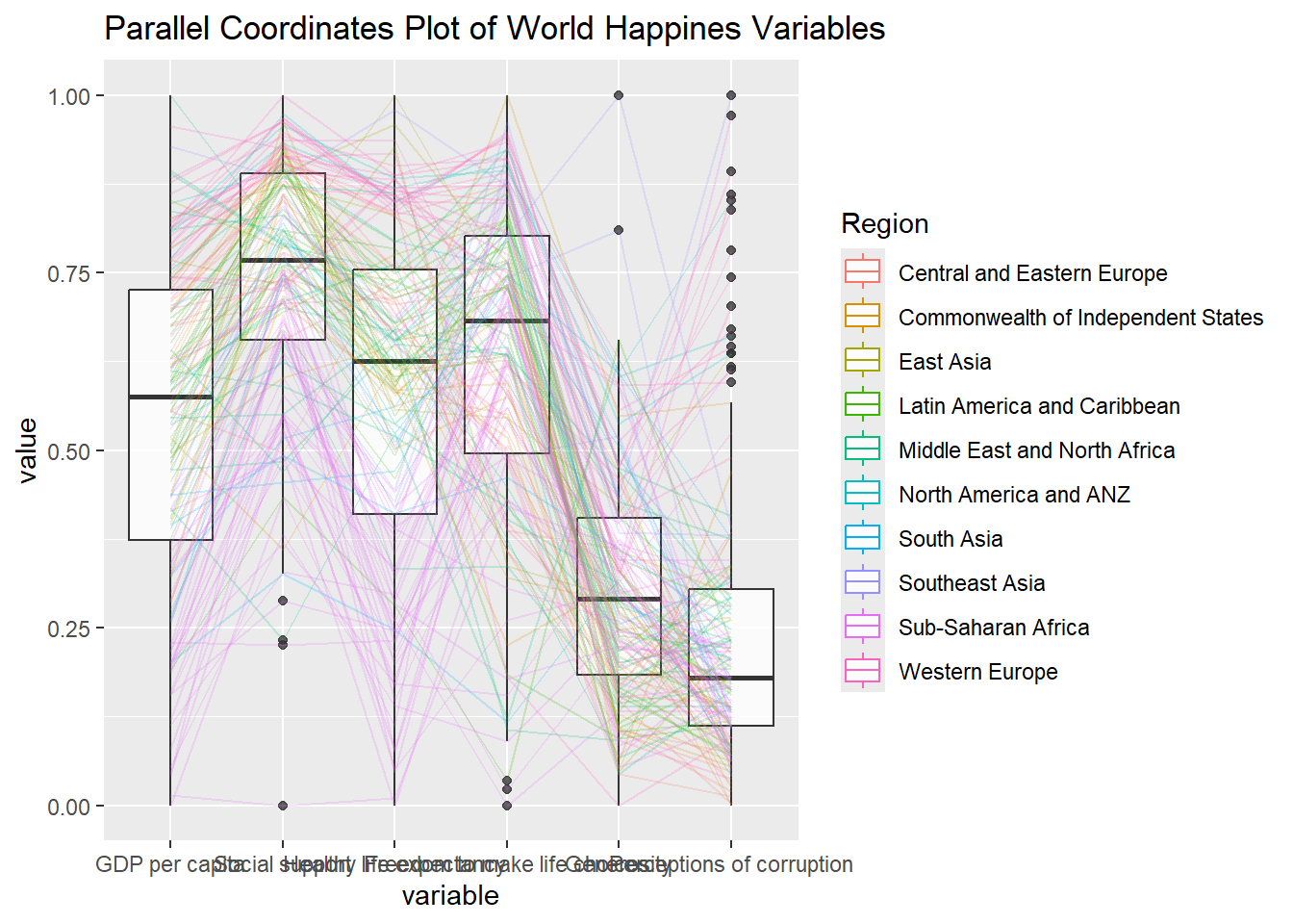
ggparcoord(data = wh,
           columns = c(7:12),
           groupColumn = 2,
           scale = "uniminmax",
           alphaLines = 0.2,
           boxplot = TRUE,
           title = "Parallel Coordinates Plot of World Happines Variables")
Note
groupColumnargument is used to group the observations (i.e. parallel lines) by using a single variable (i.e. Region) and colour the parallel coordinates lines by region name.scaleargument is used to scale the variables in the parallel coordinate plot by usinguniminmaxmethod. The method univariately scale each variable so the minimum of the variable is zero and the maximum is one.alphaLinesargument is used to reduce the intensity of the line colour to 0.2. The permissible value range is between 0 to 1.boxplotargument is used to turn on the boxplot by using logicalTRUE. The default isFALSE.titleargument is used to provide the parallel coordinates plot a title.
Parallel coordinates with facet
Since ggparcoord() is developed by extending ggplot2 package, ggplot2 functions can be combined with it when plotting a parallel coordinates plot.
In the code chunk below, facet_wrap() of ggplot2 is used to plot 10 small multiple parallel coordinates plots. Each plot represent one geographical region such as East Asia.
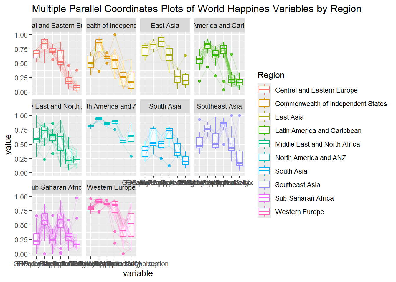
ggparcoord(data = wh,
           columns = c(7:12),
           groupColumn = 2,
           scale = "uniminmax",
           alphaLines = 0.2,
           boxplot = TRUE,
           title = "Multiple Parallel Coordinates Plots of World Happines Variables by Region") +
  facet_wrap(~ Region)
Note
One of the aesthetic defect of the current design is that some of the variable names overlap on x-axis.
Rotating x-axis text label
For ease of reading the x-axis text labels, rotate the labels by 30 degrees using theme() function in ggplot2.
ggparcoord(data = wh,
           columns = c(7:12),
           groupColumn = 2,
           scale = "uniminmax",
           alphaLines = 0.2,
           boxplot = TRUE,
           title = "Multiple Parallel Coordinates Plots of World Happines Variables by Region") +
  facet_wrap(~ Region) +
  theme(axis.text.x = element_text(angle = 30))
Note
- To rotate x-axis text labels,
axis.text.xis used as an argument to thetheme()function.element_text(angle = 30)rotates the x-axis text by an angle 30 degree.
Adjusting the rotated x-axis text label
Rotating x-axis text labels to 30 degrees makes the label overlap with the plot. This can be avoided by adjusting the text location using hjust argument to theme’s text element with element_text(). axis.text.x is used to change the look of x-axis text.
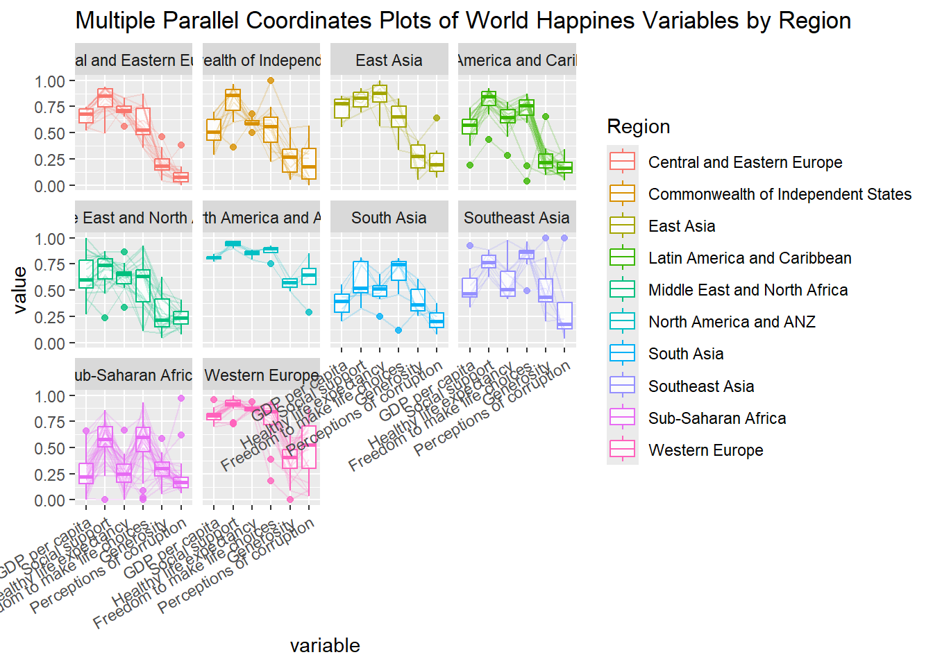
ggparcoord(data = wh,
           columns = c(7:12),
           groupColumn = 2,
           scale = "uniminmax",
           alphaLines = 0.2,
           boxplot = TRUE,
           title = "Multiple Parallel Coordinates Plots of World Happines Variables by Region") +
  facet_wrap(~ Region) +
  theme(axis.text.x = element_text(angle = 30, hjust=1))
Plotting Interactive Parallel Coordinates Plot: parallelPlot methods
parallelPlot is an R package specially designed to plot a parallel coordinates plot by using ‘htmlwidgets’ package and d3.js.
The basic plot
The code chunk below plot an interactive parallel coordinates plot by using parallelPlot().
wh <- wh %>%
  select("Happiness score", c(7:12))
parallelPlot(wh,
             width = 320,
             height = 250)
Note
Note: Some of the axis labels are too long. You will learn how to overcome this problem in the next step.
Rotate axis label
In the code chunk below, rotateTitle argument is used to avoid overlapping axis labels.
parallelPlot(wh,
             rotateTitle = TRUE)
One of the useful interactive feature of parallelPlot is that a variable of interest can be clicked, e.g., Happiness score, the monotonous blue colour (default) will change a blues with different intensity colour scheme.
Changing the colour scheme
Change the default blue colour scheme by using continousCS argument as shown in the code chunk below.
parallelPlot(wh,
             continuousCS = "YlOrRd",
             rotateTitle = TRUE)
Parallel coordinates plot with histogram
In the code chunk below, histoVisibility argument is used to plot histogram along the axis of each variables.
histoVisibility <- rep(TRUE, ncol(wh))
parallelPlot(wh,
             rotateTitle = TRUE,
             histoVisibility = histoVisibility)